The 2024 baseball season kicked off on March 28, but the preseason was not-at-all uneventful. Nike, the MLB’s official jersey provider, introduced their new “Vapor Premier” jersey line with Fanatics, which stirred up a horrifying yet hilariously tragic controversy during spring training.
Baseball’s history of uniforms is a fascinating business. Sometimes you’ll see priceless gems, like the simple, sublime ‘72 Atlanta Braves, or the baby blue Montreal Expos, or the wondrous-yet-blinding comet striped Houston Astros. And these masterpieces are fun to talk about (and glorious to look at), but it’s just so much better to absolutely trash baseball’s most horrid uniforms.
Let’s look at the wonky, eccentric history of baseball fashion, all the way from the early 70s to the 2024 “Vapor Premier” controversy.
1972: San Diego Padres All-Yellows
Every time I look at these jerseys, which are wholly splattered with putrid yellow and muddy brown, my brain stings. I can tolerate the color scheme in its modern form, but not at all in this disgusting phase. These fits should be given the name 18-3-202, the Colorado penal code for assault and battery, which it has committed unto my eyes.
1976: Chicago White Sox Shorts
I challenge you to visit the internet and look up “worst baseball uniforms ever.” Many sources will agree that the infamous White Sox Shorts top the list. Without the baseball caps, you could have mistaken these for basketball uniforms. I bet Larry Bird, famous for his iconic short-shorts look, would have worn these well.
They lasted only three games. Serves them right.
1970s-80s: Milwaukee Brewers Baby Blue
The baby blue, as previously mentioned, worked well for the Expos. I would argue it also works well for the Philadelphia Phillies, the Kansas City Royals, and even the three-tone color palette of the St. Louis Cardinals. It did not work for the Brewers, with the yellow trim mixing uncomfortably with the sky blue.
Even worse, the team is bringing back this regrettable color scheme with their new City Connect “Brew Crew” fits. It didn’t work 50 years ago, and it still doesn’t work. (But I do have to applaud that incredible fan-designed glove MB logo.)
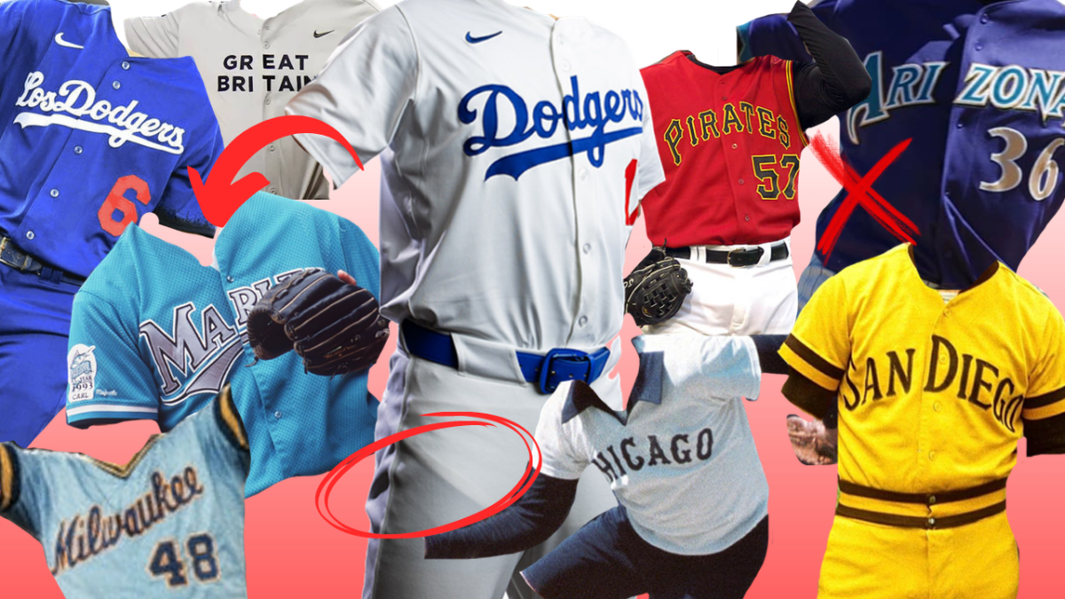
1993: Florida Marlins Blinding Blue
Logo? Great! Lettering? Solid! Color? Sigh. A different shade of blue, one less offensive to the eyes than the radioactive aquamarine would’ve done wonders.
1990s-present: Arizona Diamondbacks Ongoing Color Scheme Swaps
At some point, they just have to pick a color. Red and black works fine, but not when laced with weird turquoise and violet accents. These uniforms really sank to an all-time low with their 1990s alternates, which featured a solid purple field, gold lettering, turquoise and blue lining, all with black caps and long sleeves. Who in their front office thinks it’s a good idea to go through this constant color-changing nightmare? (Answer: the guys who know they can cash in with each uniform change.)
2008: Pittsburgh Pirates Red Alternates
Some say the iconic Pittsburgh yellow uniforms with goofy box caps are on the Worst Of All Time list, but I believe they are a work of genius. But these alternates, I cannot defend. We can commend the city of Pittsburgh on their consistency of color scheme, which applies to the Pirates, the Penguins, and the Steelers, referencing the city’s coat of arms. They should never deviate, especially with this weird red color that looks like a construction vest and throws off the entire vibe.
2021: Los Angeles Dodgers Boring City Connect Jerseys
Nike’s alternate “City Connect” jerseys highlight some element of a city’s local identity, and many (including me) have come to support these new uniforms. I especially like the Washington Nationals’ cherry blossoms, Chicago White Sox’s Southside jerseys, and our own Colorado Rockies’ license plates (zero bias, I swear).
But the Los Angeles Dodgers, by a long shot, gave the most pathetic effort towards the campaign. Their simple “Los Dodgers” branding is lazy. The cap lacks an alternate logo, the color scheme is the same as always, and the jerseys look like what a team might put on to celebrate Latin Night.
Talk about being snobbily attached to your own beloved color scheme. At least they participated; the New York Yankees are so pretentious about their own heritage that they refuse to engage with City Connects at all.
2023: Great Britain, World Baseball Classic
I’m glad they spent an entire hour the night before the tournament hand crafting these works of art with detail and care. PSA: minimalism doesn’t always work! These jerseys were of such poor quality that the plain-font lettering literally fell off at various points during their short-lived tournament appearance.
2024: Nike “Vapor Premier” Scandal
The new uniforms were supposed to be the most comfortable possible for each player, but with those lightweight and breathable qualisties, comes a great cost.
First, players said they felt like “replicas” you might find from a merchandise store. They looked cheap, despite their hefty 450 dollar price tag. Then, there was a pants shortage and players reverted to the old Majestic brand trousers. Finally, photos uncovered the scary fact that the new “Vapor Premier” slacks were a little too transparent, and players could expose themself whenever they bent down to field a ball or lead off a base. Baseball is watched by children! Keep it PG, Nike.
Photos went viral of a photoshoot of Shohei Ohtani in his new Los Angeles Dodgers uniform, where you can clearly see the shirt tail tucked in under the pants. If you can see the shirt during a photo shoot, what else might be revealed in play?
Undoubtedly, designers have made a lot of mistakes in their work with countless uniform failures. The 70s and 80s were all time highs (or lows?) for wacky color schemes and fashion. But the current uniforms give those bygone eras a run for their money. Clearly, the passing of those legendary decades doesn’t mean we will never have a hysterically execrable outfit donned in the MLB.